
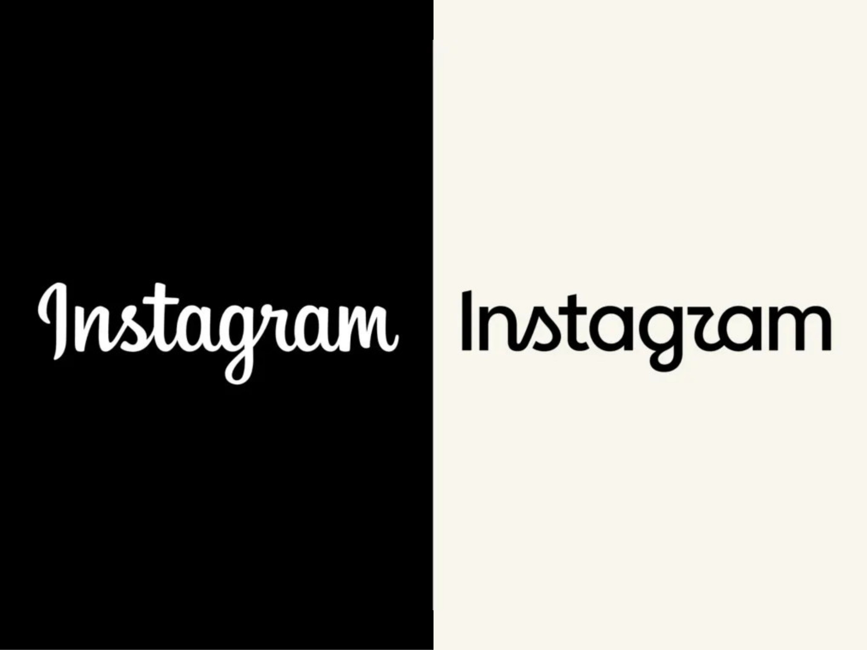
Last week, Instagram stirred up some controversy for a move that — shockingly, for a Meta brand — had nothing to do with AI or the harms of social media: It updated its logo.
The refresh is the first update the company has made to its wordmark in a decade, Instagram chief Adam Mosseri wrote on the platform last Thursday. Mosseri called it, “Cleaner and more modern, with references to the original and the simplicity and craft that’s always made it Instagram.”
The update features a mostly sans serif font with a few cursive letters and some idiosyncratic ligatures, which immediately provoked a flood of critiques on social media. Chief among them was the stylized cursive “r” that looks a little like a “z,” so the wordmark appears to spell “Instagzam.” “Soulless” was another common take, as well as, in the words of Ars Technica writer Aurich Lawson, “the perfect embodiment of AI slop.”
“Design peeps are going to have a fun day tearing it apart,” wrote social media consultant Matt Navarra on X.
We thought so too, so we asked four professional designers what they thought of the new wordmark, which, for all we know, we may very well be stuck looking at for the next 10 years.
First and foremost, Josh Klenert thinks it’s important to remember that change is hard. The Phoenix-based designer and creative director has worked with a long list of companies on rebrands, so he knows that criticism, and even outrage, is par for the course in the first few days after release.
“People are comparing something unfamiliar to something they’ve looked at for the last 10 years,” he said. “With a redesign like this, you could throw out all the history and start over, but I think they did a pretty good job of connecting to the past.”
Specifically, Klenert said Instagram’s wordmark refresh followed a similar arc as its camera icon: The original script wordmark matched the “quirkiness” of the original Polaroid-style icon. Now, they’re both streamlined but still playful. “It’s much more cohesive to the whole brand identity,” he said.
Taylor Le, the creative director for the San Francisco Standard, agreed. “When you look at it holistically as a system, and not just the wordmark, it makes sense,” she said.
“The original logo is a little outdated because of the script. From far away, it looks like something that you could pull from Google fonts,” she continued. Now, “It’s legible…and there’s a cleanliness to it, but there’s sort of an edginess to it, too.”
Ernie, another designer who asked Gazetteer to not use their last name because they frequently work with tech companies, agreed that the new logo is a natural evolution of the old one — insofar as they’re both “hokey.”
“In my opinion it’s ugly,” they said over email. “This new logo keeps the hokey but adds the corporate soullessness of a salad slop chain, like a down-market Sweetgreen.”
On the other hand, Le noted that the same elements some Instagram users might consider soulless might help Instagram’s designers in ways most people can’t see. “Maybe ‘modern’ means that it’s fitting different aspect ratios, or other things they’re doing in the back end that we’re not seeing,” she said.
In general, Le said, to undertake a rebrand “there has to be a reason” — especially for a product as ubiquitous as Instagram. “Maybe, there was something in their brand that wasn’t working, and they’re trying to evolve it.”
Justin Carder has one theory about that. This week, a landmark trial against Meta began: Twenty-nine states are suing the Instagram and Facebook parent company for creating purposefully addictive platforms targeted at children. With that in mind, Carder, an Oakland-based designer and the owner of the community art studio Bathers Library, speculated that Instagram may be trying to neutralize its reputation with a simplified logotype.
“They want to disappear a little bit. I think they want to make less of a statement,” Carder said. “Because it’s so boring, right? The logo itself, there’s no sex. It’s not exciting.”
He compared it to TikTok, whose candy-colored music note glyph signals fun at first glance. “When I look at the TikTok logo, I feel a general sense of, ‘Something fun’s happening in there!’ As for Instagram, I think they’re trying to decentralize their personality somewhat,” which he said may also help the brand distance itself from its underage consumer base.
“It has a friendliness to it that is very much within the elder millennial sort of branding,” Carder said. “It’s not going for kids. Like, that’s not who the logo is for.”
If a more neutral look was the goal, Le thinks Instagram accomplished that. “I think it’s working,” she said. Aesthetically, it’s growing on her. “As a human, I was jarred by it initially, but it’s only been a week. The more I look into the thinking behind it, I’m like, ‘Okay, I’m in.’”